Architecture August 5, 2013 By Nalina Moses

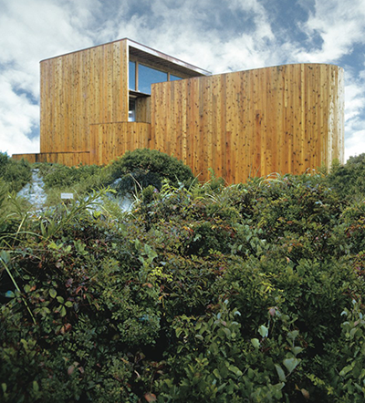
Roeder House, Fire Island Pines, NY, 1969.  Architect Horace Gifford.

Roeder House, Fire Island Pines, NY, 1969. Architect Horace Gifford.

building pleasure header Building Pleasure
Between 1962, just a few years after he left school, and 1992, when he died, architect Horace Gifford built forty modern houses on Fire Island, the sandy sliver of land that buffers Long Island from the Atlantic Ocean.  A new book by Christopher Bascom Rawlins, Fire Island Modernist: Horace Gifford and the Architecture of Seduction, recognizes his legacy.

Fire Island, a 31-mile long stretch of ungroomed white beaches and wild grasses that, at its widest points, is not even three miles wide, is a fragile landscape, vulnerable to storms and erosion, with minimal infrastructure. Most areas are connected with boardwalks and have no roads, and are reached from the mainland most easily by ferry. This unique geography fosters tight, intimate communities, and over the decades the island has been a vibrant haven for artists and for gay men and women. In the summer its population swells with day-trippers and revelers.

Gifford’s houses, modestly scaled and terrifically stylish, suit both the place and the people. They’re constructed from the same mundane materials that suburban wood frame houses are, but rendered in sophisticated modern forms.

Slideshow

1 2 3


Books May 14, 2013 By Nalina Moses

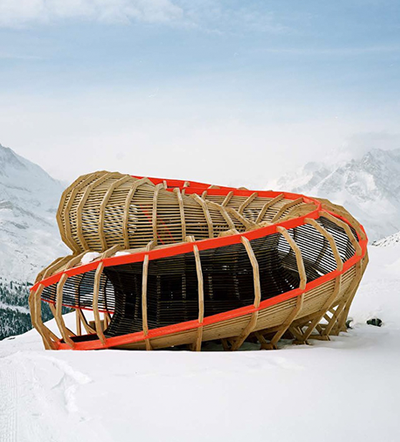
Entree Alpine Panoramic Structure, Alice Studio/Atelier de la Conception de L'Espace, Valais, Switzerland.

Entree Alpine Panoramic Structure, Alice Studio/Atelier de la Conception de L'Espace, Valais, Switzerland.

rocktheshackheader Rock the Shack
In the same way that we need a vacation to rest after a vacation, we might need a home where we can chill out after spending time at home. Even modest houses and apartments today are so richly furnished and plugged-in that we can barely rest when we’re inside: we’re streaming TV shows and music, working remotely, and connecting electronically with loved ones around the world. Home can be as demanding and draining as the workplace.

Perhaps the answer really is another home, a small shed in a quiet, out-of-the-way place, where we can retreat from both professional and personal demands. There are some spectacular options inside the book Rock the Shack: The Architecture of Cabins, Cocoons and Hide-Outs. These refuges are, for the most part, small, freestanding structures on rural sites, most of them located so remotely that there are few other structures, or even roads or walkways, in sight. But unlike typical country homes these places aren’t programmed for leisure: they don’t have great rooms, tennis courts, patios and pools. Instead they offer spare interior spaces for living, windows to stare out of, and immersion in a powerful landscape.

The most dramatic homes have been designed to support one single activity. Some are studios for painting or writing, some are playhouses, and some aren’t much more than elaborate sleeping chambers.

Slideshow

Next

Architecture December 6, 2012 By Nalina Moses

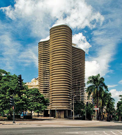
Paulo Niemeyer Apartments, Belo Horizonte, Brasil, 1954-60.

Paulo Niemeyer Apartments, Belo Horizonte, Brasil, 1954-60.

headergood OSCAR NIEMEYER
If we stop to remember Oscar Niemeyer, the great Brazilian architect who died this week at the age of 104, it should be less to mourn his passing than to admire a life richly lived. Niemeyer accomplished what few architects can. Over a career that spanned eighty years he designed hundreds of buildings whose forms helped forge his country’s contemporary identity. He built Brazilian style.

Niemeyer was in the right place at the right time and possessed just the right attitude. His country’s immense, rolling landscape and tropical climate offered the perfect setting for an abstract, sculptural architecture. He came of age as an architect in the 1950’s, at a time when Brazil was becoming more unified politically and undertaking enormous building and infrastructure projects. And he was a unrepentant sensualist, an aesthete and ladies man whose passions drove him to pursue enormous commissions like the capitol buildings in Brasilia, and to celebrate beauty above all else. All of these identities were merged in his work, an architecture of immense reinforced concrete shells and planes, at once archly elegant and dazzlingly sensual.

His style has been called “tropical modernism” to distinguish it from the works of European contemporaries, who used a similar vocabulary of slender columns, open plans, and ribbon windows, but who fixed its rules and meanings philosophically.

Slideshow

Next

Architecture, Book December 5, 2012 By Nalina Moses

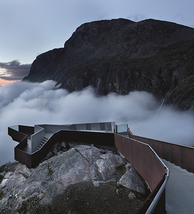
Trollstigen National Tourist Route Project, Trollstigen - Møre and Romsdal, Norway, 2005-2012.  By Reiulf Ramstad Architects.

Trollstigen National Tourist Route Project, Trollstigen - Møre and Romsdal, Norway, 2005-2012. By Reiulf Ramstad Architects.

ONCEINALIFETIMEHEADER Once In a Lifetime
We tend to travel in one of two ways: to a city to dive into its rhythms and culture, or to some out-of-the-way place to abandon ourselves to the landscape. It’s this second kind of adventure that’s the focus of Once in a Lifetime: Travel and Leisure Redefined. The book showcases new international lodges, campsites, retreats and lookouts that lure guests to a quiet, secluded place.

Instead of high thread count sheets and Michelin-star restaurants, what these places offer is private, uninterrupted access to a special landscape. So it’s regions with extreme, picturesque geographies, especially those in less-traveled corners of the globe, that offer some of the finest destinations. The book takes us to the backwaters of Cambodia, forests in the Alps, and the deserts of Namibia and Tanzania. These lodges and the amenities they offer are modest compared to typical full-service resorts. Instead they break down the routines of sleeping, bathing and dining into clarifying essentials, pursuing sensuality over opulence.

The architecture of these retreats sits restfully within the surroundings and opens itself radically to the outside. Sometimes the experience stimulates, like the otherworldly forest views that pour through wraparound picture windows at the Juvet Landscape Hotel in Norway.

Slideshow

Next


Architecture, Book November 6, 2012 By Nalina Moses

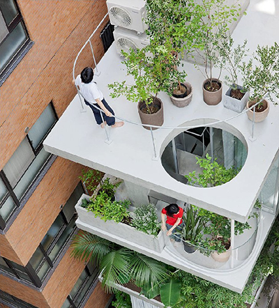
Garden and house, Tokyo, Japan, 2011. Office of Ryue Nishizawa.

Garden and house, Tokyo, Japan, 2011. Office of Ryue Nishizawa.

skysheader The Skys the Limit
If there’s any rule at all governing architecture today, it’s that anything goes. Advanced computer-assisted modeling and fabrication techniques make it possible to build highly complex shapes. Emerging economies and burgeoning cities demand super-sized structures. And there’s no lingua franca for architects working around the world: just about anything each one of them draws can be built. A new book, The Sky’s the Limit: Applying Radical Architecture, takes a closer look at some prominent avant-garde buildings from around the world and tries to puts a finger on what’s really going on. It’s no easy task.

This book classifies buildings according to their physical character: organic, sharp-edged, pixellated, interior, and outward-looking. While radially different from one another, each of these approaches can be understood as a form of resistance to the generic, commercial glass-box buildings that have come to populate our cities. There’s a movement towards gently swollen and rounded forms, expressed in a language similar to Zaha Hadid’s Acquatics Center for the 2012 London Olympics. There’s also a movement for modulated structures that have been broken into an array of smaller parts, like Frank Gehry’s Guggenheim Museum in Bilbao. Both these types of buildings reflect a yearning for more varied, surprising and sensual forms. In that sense they’re opposed to orthodox twentieth-century modernism.

Slideshow

Next

Design July 26, 2012 By Nalina Moses

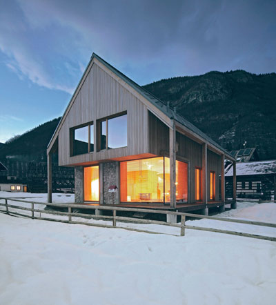
Verbier, Switzerland.

Verbier, Switzerland.

Oldwoodtitlenew Fiona Barratt Campbell
Using repurposed and reclaimed construction materials has gone beyond ecological propriety and become high style. Just take a look at the spaces crafted by London-based designer Fiona Barratt-Campbell, who weaves reclaimed wood into contemporary interiors with striking ease. At the Lodge, a ski chalet in Switzerland, weathered wall panels give the space a cave-like warmth. At a house in Harrogate, a patio table and lounge chairs crafted from railroad ties have a cool, post-industrial sensibility. And at an indoor swimming pool in France, twisting black tree trunks have the presence of expressionist sculptures.

Just like working with other kinds of repurposed materials, working with reclaimed wood requires special flexibility. As Barratt-Campbell describes, “Reclaimed wood can often prove difficult to work with as it is not in a uniform size or thickness and is often riddled with old nails, creosote and tar, so the design has to be adapted to suit these imperfections.” And it requires creative sourcing and fabrication. Barratt-Campbell partners with “a fantastic company” in the north of England to find lots of old wood and devise finishes will enhance their natural grain and color. She says, “I usually design a piece of furniture first and then ask our furniture makers to source the right material to work with. We work very closely together on the actual making of the piece so that the finished item is as my vision.”

Slideshow

Next

Architecture July 12, 2012 By Nalina Moses

<em>Alpine Hut, Stara Fuzina, Slovenia.</em> OFIS Arhitekti. Photo © Tomaz Gregoric.

Alpine Hut, Stara Fuzina, Slovenia. OFIS Arhitekti. Photo © Tomaz Gregoric.

smallecohousesheader small eco houses
We already know that green living means making houses that are smaller and more energy-efficient, reusing existing structures, and incorporating repurposed materials. The new book Small ECO Houses accepts these assumptions and adds a provocative new one to the mix: prefabrication. Most of the houses in this portfolio of outstanding new designs from around the world are mobile homes, or have been assembled from standard modules that were fabricated in a workshop and then delivered to the site. Yet they’ve been conceived with such refinement that it’s difficult to believe they weren’t custom-made.

In the United States, certainly, prefabricated houses carry a strong stigma. They’re considered shoddy and impermanent, a kind of shelter that’s more appropriate for emergency relief than real living. Now designers are looking more closely at prefabrication as a way to control costs and quality by employing highly skilled craftspeople to build on a larger scale in a controlled, studio environment. And designers are bringing a broader, more sensuous palette of materials to the task. There are no white corrugated aluminum panels or flapping screen doors here. Instead, the modestly-sized structures pictured in the book are clad with wood boards, steel panels and rough brick that will weather naturally over years. And the structures are finished with a layer of details — awnings, railings copings — that add sophistication.

Slideshow

Next


Architecture May 23, 2012 By Nalina Moses

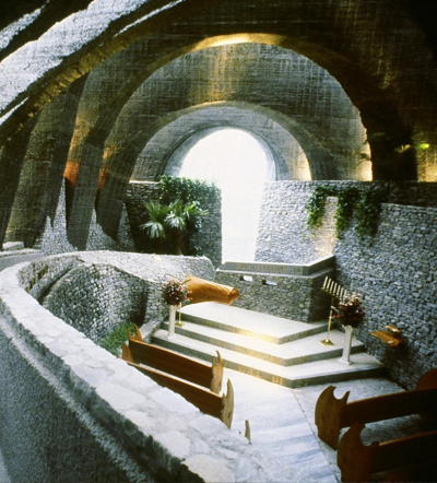
Hoshino Chapel, Karuizawa, Japan, 1987.

Hoshino Chapel, Karuizawa, Japan, 1987.

kendrickbangstitle kendrick bangs kellogg
On his website home page, San Diego architect Kendrick Bangs Kellogg says this about his work: “Large or small, Since 1957, Anywhere on earth or moon.” For those familiar with his buildings, dense structures forged from expressive, otherworldly forms, these assertions seem right on. They’re a succinct expression of Kellogg’s sweeping, elemental architecture.

While Kellogg was trained as an architect, it’s probably more accurate to think of him as a master builder, like the anonymous Medieval masons who raised the cathedrals. He’s less interested in the rules of design than in potentials of craft and construction. A friend, artist James T. Hubbell, remembers the construction of one of Kellogg’s first buildings, which had steep roofs. When the head carpenter refused to cut rafters at an unorthodox angle Kellogg asked for the saw and trimmed them himself. He’s a licensed contractor and has executed several of his own buildings. The design-build ethos comes natural to Kellogg, who says it’s “a process that has been around since humans were able to move rocks in a cave.”

To those who know him and have worked alongside him Kellogg is something of an idol. His work steers clear of trends, and springs instead from an indelible personal vision. Another friend, architect Wallace Cunningham, remembers first meeting Kellogg in the 1970’s: “He was the established, brilliant architect on the scene, the San Diego Man.”

Slideshow

1 2 3

Architecture April 24, 2012 By Nalina Moses

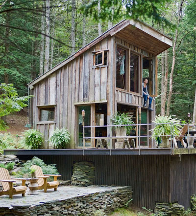
Scott Newkirk House, Yulan, NY / Copyright 2012 Kodiak Greenwood

Scott Newkirk House, Yulan, NY / Copyright 2012 Kodiak Greenwood

olsenheadergood Richard Olsen
When the back-to-the-earth movement first took hold in the 1960’s and 70’s, a great number of people abandoned their subdivisions and cities and set out to build their own homes. Today, as Americans grow more passionate about sustainability, home remodeling, and artisinal craft, it seems like the perfect moment to look back at the handmade house movement and also at the houses themselves. A new book, Handmade Houses, by Richard Olsen, does exactly that.

Olsen revisited first-wave handmade houses around the world, many of which are now thirty and forty years old. Built lovingly and exuberantly from timber, fieldstone, plaster, and sod, these aren’t the kinds of houses that adorn typical coffee table books. The book’s warm, personal narratives and sumptuous photographs are pleasing, and at the same time offer some powerful, countercultural propositions about lifestyle, aesthetics and design. These are houses that were built one-at-a-time without regard for conventional styles, with an eye to the character of the owner rather than the demands of the market.

Olsen recently shared his ideas with Planet about the origins of the handmade houses movement, its relevance today, and his own quest to build a handmade house.

Slideshow

1 2 3 4 5 6

Architecture April 2, 2012 By Nalina Moses

Party Foundation Monument, Pyongyang. Images courtesy of DOM Publishers and Philipp Meuser.

Party Foundation Monument, Pyongyang. Images courtesy of DOM Publishers and Philipp Meuser.

headernew Visiting North Korea
The Architectural and Cultural Guide: Pyongyang looks like any other city book for savvy travelers. It’s crammed with luscious maps and photographs and formatted in two slender, easy-to-carry volumes. But the guide is really a kind of provocation, since it’s virtually impossible for citizens of democratic countries to visit the North Korean capital city, home to three million people, unless they enter through China and travel with a government-led tour group. And the city’s only sanctioned tourist destinations seem to be its bombastically over-scaled memorials, museums, and sports arenas. The book doesn’t offer up any obvious tourist attractions like shopping streets, historical districts, or grassy parks, but instead formidable concrete government buildings and apartment towers. Not surprisingly, estimates are that the city welcomed only a few hundred tourists last year. This is not Paris.

Slideshow

1 2 3